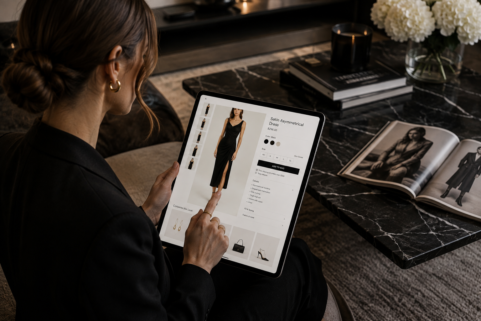
Here is a moment every fashion eCommerce team has lived through. You pour resources into a product page: better photography, tighter copy, social proof, user content. Product detail page conversion still does not move. You test the button color. You add a size guide. You shave 200 milliseconds off load time. Nothing.
The problem is not execution. It is architecture. The modern product detail page was built to answer questions. Somewhere along the way it became something else: a decision loop that pulls buyers away from the product they came to buy. For eCommerce leaders, it is one of the most expensive structural problems hiding in plain sight. This piece is about AI styling for fashion retailers, and it explains why the page fights you.
The page built to educate has become a page built to distract
Think about what a typical fashion product page hands a shopper who arrived ready to buy. An image gallery. A color and size selector. A price. An add-to-cart button. Then: related items. “You may also like.” “Complete the look.” “Customers also viewed.” “Recently viewed.” A link back to the category. A style filter still sitting in the nav. Maybe an editorial module. A user-content carousel at the bottom.
Every one of these was added with good intentions: help the shopper discover more, reduce bounce, lift average order value. Together, they do something counterproductive. They teach a buyer to leave.
The behavioral research backs this up. The Iyengar and Lepper jam study found that when shoppers saw 24 varieties, only 3% bought. When the display dropped to 6 varieties, 30% bought. Fewer choices produced ten times the sales. A meta-analysis of nearly 100 studies on choice overload confirmed the pattern: too many options reduce satisfaction, raise regret, and lower the chance of buying at all.
On a product page, a shopper drawn to a specific item should not have to make decisions. She should be guided toward commitment. Instead, the standard layout restarts the consideration process, pulling her back into browse mode at the exact moment she was ready to buy.
The path teams assume vs. the one actually happening
Most product-page decisions assume a straight line: a shopper finds a product, lands on the page, gets the information she needs, and buys. The page is built for that shopper. That is not how fashion shopping works online.
The average fashion shopper views 32 pages in a single session before placing an order. That number is striking. Not because it shows indecision, but because it shows the absence of a clear path. The layout is built to be explored, not to close. So shoppers explore, cycle through alternatives, pile up options, and struggle to commit to any of them.
 Here is how it actually unfolds.
- Discovery. She finds a product through search, social, email, or an editorial feature. She arrives with some interest. Not strong intent, but interest.
- Evaluation. She looks at the images, checks the price, reads the description. This is the trust and inspiration window, where the page either deepens her interest or does not.
- Drift. The “you may also like” row appears. One item catches her eye. She clicks. Now she is on a different product page, starting from scratch.
- The loop. This repeats. Four, six, ten products. Each new page restarts consideration. Each click refreshes her options. The longer it runs, the less likely any single purchase becomes.
- Abandonment. Decision fatigue sets in. Research shows measurable fatigue after comparing more than seven to nine options. A 2024 study of 1.6 million users found that 64% of the drop in conversions came from users simply not clicking on anything. Paralysis, not preference.
This is the loop the standard layout creates. It is not user error. It is a structural feature working exactly as designed, just not in the direction that drives revenue.
The two hurdles a product page must clear
When a shopper lands with real interest, she has two questions. Leave them unanswered and she goes back to browsing.
Do I trust this product? Does it look right? Will the quality match the price? Will it fit? Is the brand credible? Can I return it easily?
Can I see myself in this? Is it right for my life? How would I wear it? What would I wear it with? Does it work for the occasion I am imagining?
These are not informational questions. They are emotional and aspirational. A fabric table cannot answer them. They need context, vision, and styling. The standard page mostly ignores the second one. It shows the product alone: a model on white, a flat lay, maybe a lifestyle shot. It does not show her what a world with this product in it looks like. Without that picture, the decision stays abstract, so she leaves or starts clicking through alternatives, hoping the right combination finally clicks. That is the browse loop, and the page keeps it running.
What “more discovery” actually costs
The urge to load a product page with cross-sells comes from a fair goal: lift AOV, keep shoppers on-site, reduce bounce. The data tells a more complicated story.
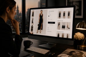 Fashion carries one of the highest cart abandonment rates in retail. Baymard puts the average online cart abandonment rate at 70.22% across 50 studies, and fashion runs higher still. Conversion is thin at the other end too: IRP Commerce, measuring live trading data, puts the fashion conversion rate at 1.74%. Meanwhile, the average product page spends its most valuable space cycling shoppers back into consideration instead of moving them toward a decision.
“More discovery equals more purchase” only holds if the shopper does not already have a product she likes. If she arrived at a specific page with real interest, every distraction is a conversion risk, not an opportunity. The irony is that the best cross-sell is not an exit to a new product. It is a reason to buy more of the current one. Showing her how the jacket pairs with the right trouser and shoe does not pull her away from the sale. It builds toward a bigger one.
What the numbers say about product detail page conversion
The clearest evidence comes from production. In Zelig’s live deployment with Revolve, across a catalog of more than 54,000 SKUs, shoppers who used Build a Look to assemble complete outfits on the page converted at 3x the control group. Session time rose more than 300%. Average order value on styled sessions rose 1.5x. Returns fell 10%. You can see the full case in our results.
Those numbers move together because the fix addresses product detail page conversion at its root. Outfit context clears the second hurdle. It gives her the aspirational picture she could not build from the isolated product view, and it moves the question from “should I buy this?” to “how many of these pieces do I need?” We break the conversion mechanism down further in our results.
The architecture problem is also a metrics problem
Part of why the layout stays broken is that the metrics reward the wrong things. High page views look like engagement. Clicks on related products look like interest. Long sessions look like depth. But if none of it turns into sales, these numbers measure the cost of the browse loop, not the value of the experience.
The KPIs that actually measure product detail page conversion are narrower and harder to game:
- Add-to-cart rate from that specific product
- Conversion rate from product-page visit to purchase
- Multi-item order rate (AOV growth through complementary pieces, not cross-sell wandering)
- Return rate (a signal of whether the context set the right expectation)
Measure the page against these and the picture changes. The page that drives the most downstream clicks is often not the page that drives the most revenue. And the page that is easiest to navigate away from is, by definition, the one least likely to close.
The way forward: build the look, then close
The fix is not to strip pages down to bare product info. It is to replace distraction with direction. The emerging model gives the product page one job: build conviction, not present options.
- Show the product in complete looks. Not adjacent products. Full outfits, styled and contextual, that answer “how would I wear this?” in the same view. This keeps her attention on the product she came for while expanding the natural basket.
- Make the look shoppable, not linkable. A “you may also like” row links out to other pages and resets consideration. An interactive outfit builder lets her swap pieces within a look and deepens it. For the logic underneath, see our guide to the outfit recommendation engine.
- Protect the trust and inspiration window. The space above the fold should do one job: build desire for this product. Everything else is secondary.
- Use personalization to reduce options, not multiply them. The strongest use of personalization is showing the right thing, not more things. A shopper who arrived from a summer-occasion editorial should see this product styled for summer occasions, not the same generic grid as everyone else.
- Measure conversion over engagement. Traffic to a page that does not convert is expensive traffic. Success is not whether the page holds attention. It is whether it produces sales.
What this means for eCommerce leadership
The product page is the most expensive real estate in your funnel. Every dollar of traffic, every influencer partnership, every email, every ad eventually lands on one. If that page is built to send buyers back into consideration instead of forward into a purchase, you are paying to fuel a loop.
The good news: this is solvable, and the brands that solve it first gain a real advantage. Interactive, look-building experiences that replace the browse loop with a buying path do more than lift conversion. They increase basket size, reduce returns because she reaches checkout with better context, and build the kind of product relationship that drives repeat purchase. Because a confident shopper returns less, the same fix also cuts returns, which we cover in styling, not sizing.
The standard page was not designed to fail. It was designed in an era when “more information” was the answer to every conversion problem. The modern buyer’s problem is not a lack of information. It is a lack of clarity. The page that wins gives her exactly what she needs to say yes: a clear picture of the product, a clear picture of herself in it, and a clear path to checkout. That is not a redesign of the product page. It is a rethink of what the page is for.
Frequently asked questions
Why is product detail page conversion so low in fashion? Because a static page answers whether the product exists, not whether it suits the shopper. It leaves the “how would I wear this?” question open, so she leaves or cycles through alternatives instead of buying.
Do product recommendations help or hurt conversion? On a page where the shopper already has a product she likes, a row of other products is an exit that restarts consideration. A styled look that expands the current item helps far more than a list that links away.
What is the single highest-impact change to a product page? Answer the shopper’s second question on the page: show the product in a complete, shoppable look so she can picture herself in it before she decides.
Zelig builds interactive look-building experiences for fashion eCommerce, designed to close the trust and inspiration gap and turn browsers into buyers. Read the Revolve results, or book a demo.